What do we test in a sales funnel?
A sales funnel is the path a shopper takes from first seeing a brand to paying. We test the paid version of that path, because it is the one a brand controls end to end and pays for every click.
We follow five stages, in order:
- Offer: the deal the ad promises and the deal the store delivers.
- Landing page: the first page after the click.
- Product page: where the shopper chooses and adds to cart.
- Cart and checkout: from “add” to the first checkout screen.
- Follow-up: what the funnel does to get a second chance, such as email capture.
For a plain-English tour of these stages, read our guide to what a sales funnel is.
How do we capture a funnel?
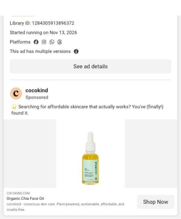
- Search the public Meta Ad Library for the brand's domain and pick an active ad that links to the store.
- Record the ad's library ID and start date, and screenshot the ad card.
- Open the ad's link in a phone-sized browser (390 pixels wide) with a fresh session and no saved cookies.
- Screenshot each step: landing page, product page, cart, first checkout screen, and any popup.
- Add one item to the cart. Stop at the first checkout screen. Enter nothing, submit nothing, buy nothing.
- Score all 25 checks the same day, from the screenshots and our notes.
We close popups and cookie banners after screenshotting them so the next step is visible. If a page fails to load for us, we say so in the teardown and do not score that page.
What are the 25 checks in the funnel rubric?
Each check has a written rule for a pass and for a partial. Anything less is a miss. Cookie and consent banners never count against a funnel, because they are often required by law.
Offer· Is the deal clear, consistent and safe to accept?
| Check | Pass · 2 points | Partial · 1 point |
|---|---|---|
| Message match | The ad's main promise is repeated on the first screen after the click. | The promise appears, but only after scrolling or on a later page. |
| Price or discount shown early | A price or discount is visible on the first screen of the landing or product page. | It appears within one scroll. |
| One clear offer | One headline deal. Extra perks support it instead of competing with it. | Two or more deals stack, but they do not contradict each other. |
| Risk reversal before the cart | A guarantee or easy-returns promise is shown next to the buy button. | It exists but sits in an FAQ, footer or later step. |
| Terms are plain | What you pay, how often, and how to cancel are stated before checkout. | Most terms are stated; one is left to checkout or fine print. |
Landing page· Does the first page after the ad do its one job?
| Check | Pass · 2 points | Partial · 1 point |
|---|---|---|
| Says what it is | The first screen names the product and what it does in plain words. | You can work it out, but only from the image or after scrolling. |
| Primary button on first screen | One main call to action is visible without scrolling, or sticks to the screen. | A button exists in the first screen but competes with others. |
| Proof on first screen | A rating, review count or credible press line is visible without scrolling. | Proof appears within one scroll. |
| One tap to the buy box | The visitor can reach a price and add-to-cart button in one tap or less. | It takes two taps, or one tap into an extra step such as a quiz. |
| Nothing blocks the first screen | No popup covers the page on arrival. Cookie and consent banners are not counted. | A popup appears, but only after the visitor scrolls or waits. |
Product page· Can a buyer choose and commit without hunting?
| Check | Pass · 2 points | Partial · 1 point |
|---|---|---|
| Price visible | The price is on the first screen of the product page. | The price is within one scroll. |
| Add-to-cart reachable | The add-to-cart button is on the first screen or sticks to the screen. | It is within one scroll. |
| Sensible default | Size, plan or shade comes pre-selected with a clear reason, or no choice is needed. | A default exists but the trade-off between options is unclear. |
| Rating beside the buy box | A star rating or review count sits within one screen of the buy button. | Reviews exist, but further down the page. |
| Shipping and returns beside the buy box | Shipping cost or threshold and returns are stated next to the buy button. | Only one of the two is stated there. |
Cart & checkout· Does the path from 'add' to 'pay' stay short and honest?
| Check | Pass · 2 points | Partial · 1 point |
|---|---|---|
| Clear confirmation | Adding to cart opens a drawer or page that shows what was added. | Only a counter or small badge changes. |
| Savings and thresholds are plain | Discounts and free-shipping thresholds add up on screen. | They are shown, but the numbers are hard to reconcile. |
| Checkout within two taps | The first checkout screen is two taps or fewer from the add-to-cart button. | It takes three taps. |
| Express pay up front | Wallet buttons (Shop Pay, PayPal, Apple or Google Pay) are on the first checkout screen. | They exist but sit below the fold. |
| No surprise total | The first checkout screen shows the same total as the cart, or explains the change. | The total changes and the reason is hidden behind a toggle. |
Follow-up· If the visitor leaves, does the funnel earn a second chance?
| Check | Pass · 2 points | Partial · 1 point |
|---|---|---|
| Email capture before checkout | The funnel asks for an email before checkout (popup, bar or inline form). | Only a footer form is offered. |
| Reward is stated and certain | The reward for signing up is fixed and named (for example, 10% off). | The reward is vague, or it is a prize draw. |
| One field | The form asks for an email address only. | It asks for two fields. |
| Reason to come back | A subscription or refill plan is offered for the tested product. | Subscriptions exist on the site but not for this product or path. |
| Relevant add-on | The cart or checkout suggests a related product. | A free gift is added, but nothing else is suggested. |
How is the overall funnel score calculated?
Five checks at 2 points each make a category score out of 10. The overall score is the average of the five category scores, rounded to one decimal.
Example: Cocokind scored 9 on offer, 8 on landing page, 9 on product page, 8 on cart and checkout, and 10 on follow-up. That is 44 points across five categories, so the overall score is 44 ÷ 5 = 8.8. See every check in the Cocokind funnel teardown.
Score colors follow fixed bands:
- 8.0 and up
- 6.0 to 7.9
- Below 6.0
What doesn't the score measure?
- Sales. A low score does not mean a funnel sells poorly. A brand may have tested a choice we mark down and found it works for them.
- Email sequences. We never submit a popup, so we cannot see what arrives after signing up.
- Ad targeting. We see the ad and its link, not who it is shown to.
- Every version. Stores run tests and change offers weekly. A teardown is a dated snapshot of one visit.
How do we test our own suggestions?
When a teardown says “steal this,” we want to know the idea survives contact with a real page. So we rebuild single steps, such as a landing page or a cart drawer, and click through our version the same way we click through the original.
We do that on a test Shopify store with off-the-shelf tools. Shopify's theme editor handles most product-page changes. For standalone landing pages, tools like Unbounce or Replo, which builds pages inside a Shopify store, do the job. None of these rebuilds count toward any brand's score, and we never claim to know which tools a brand uses.
Has the rubric changed?
v1.0 · November 19, 2026
First public version. 25 checks across five stages. All six launch teardowns scored with it.
When we change a check, we will bump the version, list the change here, and re-score every teardown so the table stays comparable.
Methodology FAQ
Are your sales funnel scores objective?
No score is fully objective. Ours are editorial judgments, but each one comes from 25 fixed checks with written pass and partial rules, so you can see exactly why a funnel got its number.
Do you measure conversion rates?
No. We never see a brand's sales data, and we do not estimate it. We score what a shopper can see and do on the path from ad to checkout.
Why do you test on a phone?
Most social ad clicks happen on phones, and phone screens make every extra tap and popup more costly. We use a 390-pixel-wide browser, the size of a common iPhone.
Do you buy anything?
No. We add one item to the cart and stop at the first checkout screen. We never enter an email, address or payment details, and we never submit popups.